
Basketball Shot Chart: A Coach's Weekly Planning Guide
Turn basketball shot chart insights into your weekly coaching workflow: plan practices, scout opponents, and teach players with data-driven visuals and video.
Key takeaways
- Use a basketball shot chart to map every attempt by zone, revealing efficiency patterns for weekly planning.
- Identify high-volume, low-efficiency zones with hexagonal binning to target focused drills and spacing.
- Pair practice sequences with short video clips showing decisions in those zones to reinforce cues.
- Translate chart insights into weekly objectives in planning templates and on the tactical whiteboard.
- Monitor xFG% by zone and Shot Quality to refine reps and defend against ineffective shot selection.
What a basketball shot chart is and why coaches use it
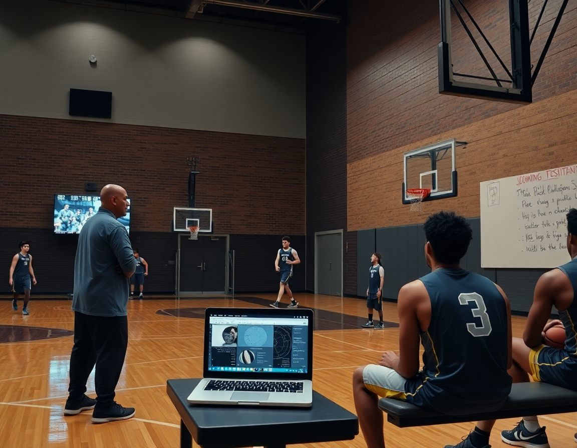
A basketball shot chart is a visual map of every shot attempt on the floor, showing where shots were taken and whether they went in. It’s not just a statistic; it’s a location-driven story that helps you move beyond raw percentages. With a chart, you can see whether your offense gets to the rim consistently, or if your best looks cluster in the corners, above the break, or at the top of the key. As a coach who relies on planning templates and a tactical whiteboard, I use the chart to spot patterns that guide weekly focus.
Visually, charts translate production into location and efficiency. You’ll see shots plotted by zones, which is where hexagonal binning comes in—grouping space into meaningful chunks to reduce noise. The chart also exposes spatial efficiency and xFG% by area. High-usage zones with low efficiency signal opportunities in your game plan. We might call out Shot Quality (SQ) for areas where the shot selection is clean but misses due to defense. Those visuals guide how we design practice work and weekly scouting notes. Also, I watch sample size per zone and zone variance—too few shots in a bin can mislead trends, so I confirm patterns across several games before changing emphasis.
Weekly impact: use the chart to shape your week. In my planning templates, I lock on the zones highlighted by the chart and design drills that create clean looks there, then pair a short video clip to illustrate a decision in that spot. On the tactical whiteboard I diagram set plays and spacing to reinforce the flow. The scouting report notes how opponents defend those zones and where they push us into contested shots. A shareable playlist of clips keeps players aligned on what to replicate in practice and in games.

Visualization styles you’ll encounter and what they mean
Across a typical week, I lean on a few visualization styles to translate game data into actions. The shot plot shows every attempt as a dot, while zone maps lay out where we’re getting shots on the floor. A heat map and a hex map add color and texture to those patterns. In the plan, I pull a shot plot from last game to spot clusters—are we getting to the rim in transition, or settling for standstill jumpers from the right elbow? Those visuals feed the tempo of our practice plan and scripts for the whiteboard.
To read them well, you’ve got to understand what color scales, marker size, and hexagonal binning are telling you. In our workflow, darker colors often flag higher volume and tougher shots; bigger markers signal frequency, not necessarily success; and hexagonal binning smooths scattered data into meaningful neighborhoods, letting you compare spatial efficiency across the floor. When we plan drills, we ask: where do we want to compress defense or push pace? The shot chart becomes your quick-reference map for the week.
Advanced metrics like xFG% and Shot Quality (SQ) add coaching context you can act on this week. Pull xFG% by zone on the whiteboard to decide which spots deserve more reps; annotate a scouting report with where opponents bite on closeouts; export a short video clip showing the best and worst shot types for the players. The numbers don’t replace feel, they guide it, turning data into decisions on the court.

Reading shot charts to inform weekly planning
A basketball shot chart isn’t just a picture of where we shoot; it’s a compass for the week. I pull last game data and scan for zones with high volume and zones with high inefficiency. Using hexagonal binning, the court breaks into bite-sized pockets, and the heat map reveals where our shots land and where xFG% drops. I keep an eye on Shot Quality (SQ) to separate clean looks from clanky ones. When a cluster in the corner shows heavy volume but low SQ, I know exactly where to start in practice.
In the weekly plan, I translate those insights into drills and pacing. If the chart shows a needy spot—high usage, poor efficiency—I slot a drill in the plan that emphasizes shot preparation, spacing, and attack angles from that area. I’ll pair a quick on-court sequence with a short video clip to reinforce decision-making, then map the progression in our planning templates so assistants know what to run. The aim isn’t just shooting more; it’s smarter shooting and better shot selection in the plan week.
Defensive emphasis and offensive spacing go hand in hand in game prep. On the tactical whiteboard, I mark the zones we want to deny and the safe corridors we want to attack, all guided by the shot plot and heat map trends. Our scouting reports inform how opponents defend those zones, so we adjust rotations and help angles accordingly. After practice, I assemble a shareable playlist of clips highlighting the right reads from those zones and lift it into the video clip library for quick player reference. This cycle keeps the team aligned around spatial efficiency and smarter shot decisions.
Practical workflow: turning shot charts into practice and game plans
Turning last week's basketball shot chart into action starts with a clean read. I pull the chart, scan for zones where shots cluster or miss, and note spatial efficiency gaps. Using the planning template, I translate those insights into a compact weekly objective—something concrete my assistant can help execute and I can defend in a staff meeting. This is where data becomes what we actually coach.
From there, I map shots to zones using hexagonal binning to build a heat map that highlights trouble areas. Based on that map, I set weekly objectives—like lifting xFG% from the right wing by a few points or cutting contested shots from the rim. This is the moment the workflow pays off: data-to-plan, plan-to-practice, with a clear link back to our shot chart insights.
I design drills in the plan that address those zones, and I drop a clean whiteboard diagram on the page showing spacing and actions (BLOB/SLOB/ATO/PNR). I attach a short video clip from the library to illustrate the exact movement and pace. The result is a drill sequence that players can visualize before they even warm up, tying together the plan, the board, and the clip.
On court, we run the plan, and during breaks players pull up the attached clips in a quick review. I share the plan via a link—our shareable playlists—so they can study the reads and spacing between sessions. The weekly planning cycle closes with a quick check-in on the heat map and any shifts in scouting notes that might tweak the next block.
Scouting opponents with shot-chart insights
Scouting opponents with shot-chart insights starts by turning data into actionable notes. In our weekly plan, we tag zones where they shoot most and the shot types they lean on—spot-ups on the wing, drives to the rim, and pull-ups from mid-range. We run hexagonal binning and heat maps to visualize spatial efficiency and spot where their scoring is most dangerous. Those insights live in a dedicated scouting note and on the planning board, so assistants know what to pressure and what to shade off during prep.
From there, we translate the data into a scouting report focused on opponent tendencies—where they attack in those zones, their xFG%, and which players heat up when the floor opens. The Shot Quality (SQ) score and the shot plot give us quick reads for game planning, guiding defensive matchups and our own shot selection against the zones we want to shrink. It’s about turning raw numbers into concrete game calls.
Workflow in practice matters. In the plan, assign an analyst to pull clips that mirror those zones and shot types; on the tactical whiteboard, sketch defensive shells that force shots away from their comfort zones; in the video clip library, tag clips by zone and action and build a short, shareable scouting playlist for players. This is where the weekly routine becomes repeatable, and the team stays aligned.
Angle for a quick, mid-week adjustment. If the opponent relies on corner threes, gear our defense toward closing on those spots and hard-rotating to the top; meanwhile, on offense we aim to generate higher-quality looks in the zones they’ve shown vulnerability in. By game night, our plan is anchored in shot-chart insights rather than guesswork.
Shareable video playlists to reinforce learning
Shareable video playlists let you reinforce learning by curating clip sets for players or units. A 6-8 clip sequence focusing on decision-making in pick-and-roll can be watched in a short team meeting or on the bus. In my plan, I pull from the video clip library and drop those clips into a unit-specific playlist, ready to reference on any device.
Attach playlists to practice plans and scouting reports. When I map our weekly flow, I attach the unit playlists to the plan so coaches see what players should study ahead of drills, and I append a parallel playlist to scouting notes focused on opponent tendencies. This keeps learning aligned with the week’s objectives and makes it easy to pull up the right clips at the right time.
Best practices for using video in team feedback and progression are simple: keep clips short (15-30 seconds), highlight the exact decision, and tie it back to shot chart insights like zones and heat maps. Use concise notes and a quick pause to discuss the why behind each choice. By labeling clips clearly, you create a clean path from a single play to a broader habit, reinforcing the link between on-court reads and outcomes.
From a workflow standpoint, start with clip playlists that map to your weekly focuses—defense rotations, ball screens, or transition finishes. Attach these to the plan and shareable links so players can reopen the footage after practice. As you review the film together, update the playlist with new clips from recent games to show progression in shot plot and spatial efficiency.
If you build plans like this every week, CourtSensei keeps your drill library, whiteboard, and video clips in one place — try it free.
FAQ
What is the difference between a shot chart and a shooting percentage?
Think of it like this: a shot chart maps where shots come from and whether they go in; shooting percentage is simply makes over attempts. The chart adds location context, showing if you’re getting looks in specific zones and how efficient you are there (xFG% by zone). Use it weekly to spot patterns and guide practice focus.
Why do some elite players still take mid-range shots if they're inefficient?
Elite players still pull mid-range looks because the defense overcompensates elsewhere, or because the sequence creates a clean shot when the clock is tight. A smart plan weighs Shot Quality (SQ) and spatial context; if a mid-range attempt is open and maintains spacing or forces help, it earns reps. Use the shot chart to decide when those looks stay in the game plan.
How many shots from a zone are needed for reliable data?
Reliable zone data needs enough shots. Don’t draw conclusions from a handful of attempts. A practical rule: target at least 25-30 attempts per zone across several games, or combine adjacent zones into a larger bin. If data is sparse, rely on zones with stronger data and watch how results vary over time to avoid noise. This is why your week should show multiple zones under review.
Can shot charts predict future performance?
Can shot charts forecast future performance? They help identify persistent trends, like which zones reliably produce clean looks, or where defenses consistently disrupt you. They’re planning tools, not guarantees. Use them with other metrics and scouting to project week-to-week decisions, setting targets that you can defend in practice and adjust after games.
How accurate is shot location tracking?
How accurate is shot location tracking? Modern systems deliver solid accuracy, but results depend on camera setup, occlusions, and detection algorithms. Expect small errors in edge zones and occasional misreads in fast transitions. Using hexagonal binning helps smooth noise, and cross-checking with video keeps interpretation grounded.
How can shot charts be used to improve my own game?
How can I use shot charts to improve my own game? Start by mapping your shots to zones, track your xFG% by area, and set weekly goals. Build drills around your weak spots, pair on-court reps with short clips, and adjust spacing and decision-making. The chart becomes your personal practice roadmap.
